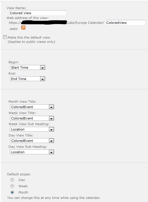
One request we frequently receive is to allow to colour events in a Calendar list for easier finding and viewing. Path to SharePoint offers a script that you may want to check. And that's basically what I did; didn't feel like reinventing the wheel. So go here and follow the instructions. If you have any questions about the original site, contact Christophe@PathToSharePoint.com But before you start, make sure you have the following: - Calendar list ready to be used - A choice column of your preference, which will be use to categorize the events on your Calendar list - A displayed column already designated (for example, Title) - A separate Colour column (calculated value) - Another calculated value column (for example, ColouredEvent) Follow the instructions on that site and you should be all set. If you have any doubts, I can assure you we were able to successfully implement this solution on SharePoint 2010. It might get a little bit tricky when you have to create the view that will display the colour-coded events. If you don't pick the right columns, it won't work. Find below a sample image of how the Calendar view should be set up. The final thing you will need is to reference the script from the page where you are displaying the coloured view of the Calendar list. To do so, upload the script to a document library, go back to the page where your calendar view displays, edit it to insert a Content Editor Web Part (CEWP), and reference the script file from the CEWP). Save and publish the page. It should work.
One request we frequently receive is to display fly-out menus, the Top Nav in place of the Quick Launch, or both. I recently found a way to completely move the Top Nav to display where the Quick Launch would normally display and hide the Quick Launch at the same time. This is what I did.
1. Make a copy of the v4.master master page, check it out, rename it, and open it to edit it;
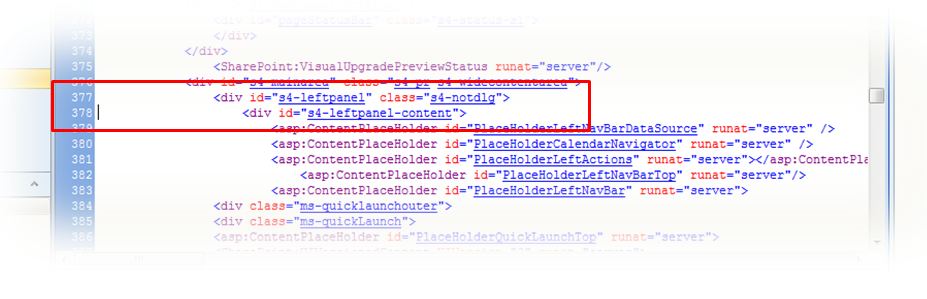
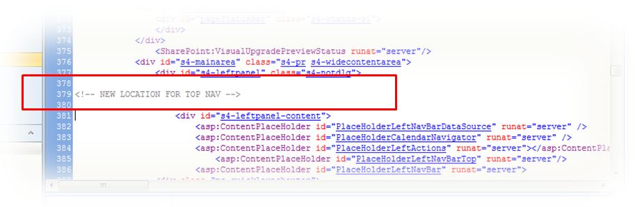
2. Assuming you have still not made any changes to your copy of the v4.master content, go to line 377. 3. I like inserting notes for future reference. So in this particular case, I'm going to insert a comment in between lines 377 and 378, as follows,
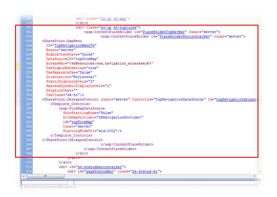
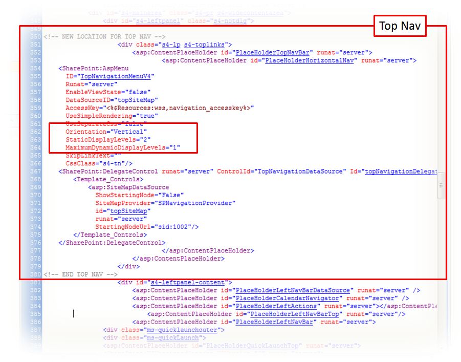
3. Once again we're going to assume you have still not made any further changes to your copy of the master page. Scroll back up and go to line 340. Select lines 340 through 368 and move this to where you inserted your comment for the Top Nav's new location. 4. Now you need to change the Top Nav orientation from horizontal to vertical. In the sample image below, this is done at line 362. Change the default setting where it says Orientation="Horizontal" to Vertical. You can also make adjustments to the static and dynamic display levels and maximum based on your site needs.
5. We also need to hide the Quick Launch so it only displays the Top Nav. To do this, scroll back to the top of your copy of the master page and locate the closing </head>. Once again we'll assume you have not made any other changes that the ones included in this blog post. Therefore, the closing </head> tag should be located at line 35. Insert a line or two between lines 34 and 35 and type in the following, <!-- BEGIN ADDED LINES TO HIDE QUICK LAUNCH --> <style type="text/css">
#s4-leftpanel-content
{
display:none;
}
</style>
<!-- END ADDED LINES TO HIDE QUICK LAUNCH -->
6. Save, check in, publish, and approve the page. Note: If you need to further customize the site for other colours than the ones used by the SharePoint theme applied to the site, you will need to further modify your copy of the master page to register your external CSS file and make a copy of the corev4.css CSS file where you can made your customizations. To learn how to register your external CSS file on your master page, visit my blog post here. For a clean copy of the corev4.css file, visit my Useful Files section. Hint: The following is a list of the main CSS classes that control the look and feel for the Top Nav: - .s4-tn - .s4-tn ul.static - .s4-tn li.static > .menu-item - .s4-tn u.dynamic - .s4-tn li.dynamic > .menu-item - .s4-tn li.dynamic > a:hover - .s4-tn li.static > a:hover - .s4-toplinks .s4-tn a.selected - .s4-toplinks .s4-tn a.selected:hover
"Hiding" would be a better way of describing what I'm about to say, since "Removing" will make SharePoint not render properly.
In other words, I do not recommend removing any Content Place Holders from SharePoint master pages. I recommend turning them off.
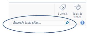
So let's say that you need to hide or remove the Search area from a SharePoint site.
Using SharePoint Designer, open your copy of the v4.master master page.
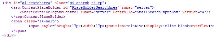
Locate the following piece of code:
If you have still never made changes to your copy of the v4.master master page, the lines of code I'm talking about go from line 330 to 337.
Tip: Using SharePoint Designer Split View, select the Search box in the lower Design frame and SharePoint will highlight the code in the upper Code frame.
Delete what you don't need. For most of my projects, I delete the entire <div>, starting with the <div id="s4-searcharea" class="s4-search s4-rp"> all to the closing </div> right after the </span>.
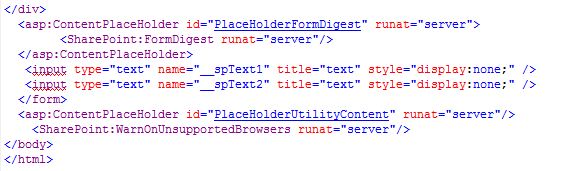
Go to the bottom of the Master Page in the Code view. Locate the following lines of code:
Insert a couple of lines right above the closing </form> tag and type the following:
<!-- Lines below added for unused Content Place Holders -->
<asp:panel visible="false" runat="server">
<asp:ContentPlaceHolder id="PlaceHolderSearchArea" runat="server" />
</asp:panel>
<!-- End added lines for unused Content Place Holders -->
Save, check in, and publish your master page. Go to the browser and test to see how it looks.
I love the fact that Microsoft now included Fields to display options within a Content Query Web Part (CQWP). In more than one ocassion where I didn't need to get too fancy about styles, I was able to do with this option instead of having to create custom styles in my Style Sheets. I'm saying this because the solution I'm about to present has been simplified to take advantage of these new SharePoint 2010 features. So let's dive in.
More than once I've been asked to use "nicer" images or small logos in place of the typical HTML bullet or the little orange square bullet that SharePoint usually displays for bulleted lists.
Step 1 - Create, Reuse, or Adapt Image to be used as Bullet
So the first thing I usually do is I create or adapt a bullet from images the customer might provide, or I create one from scratch using an imaging application such as Photoshop or Fireworks.
So once you have your image, upload it to a library of your choice. When it comes to elements that I'm going to be using as part of my custom look and feel, I have a tendency to "hide" them in places my users won't be able to find easily. More than once I ended up with that "loverly" red X in place of images because my customers would not know what the file is and delete it. So I usually create a Master Page folder within the Style Library and I upload (and publish) all my images for custom look and feel there. So this example will assume that. We will also assume the name for the image is divbullet.gif.
Step 2 - Create The Necessary CSS Class Definitions
In my copy of the corev4.css file, I create a class that usually looks something like this:
.myBullet
{
font-family: Verdana, Helvetica, Arial, sans-serif;
font-size: 8pt;
padding: 4px 0px 0px 18px;
color: #ffffff;
text-align: left;
background-image: url(PathToYourImage/divbullet.gif);
background-repeat: no-repeat;
background-position: inherit;
}
You may need to adapt the padding settings to better accomodate for the image of your choice.
Step 3 - Create The Necessary Item Styles
After making a copy of Microsoft's original Style Sheet, modify your copy to include a style that will be used by the CQWP.
<xsl:template name="MyLinks" match="Row[@'MyLinks']" mode="itemstyle">
<xsl:variable name="DisplayTitle">
<xsl:call-template name="OuterTemplate.GetTitle">
<xsl:with-param name="Title" select="@MyLink"/>
<xsl:with-param name="UrlColumnName" select="'URL'"/>
</xsl:call-template>
</xsl:variable>
<xsl:variable name="LinkTarget">
<xsl:if test="@OpenInNewWindow = 'True'" >_blank</xsl:if>
</xsl:variable>
<div id="linkitem" >
<!-- Apply special bullet styles -->
<div class="myBullet" >
<!-- Link to item -->
<xsl:call-template name="OuterTemplate.CallPresenceStatusIconTemplate"/>
<a>
<xsl:attribute name="href">
<xsl:value-of select="substring-before($DisplayTitle,', ')"></xsl:value-of>
</xsl:attribute>
<xsl:attribute name="title">
<xsl:value-of select="@Description"></xsl:value-of>
</xsl:attribute>
<xsl:value-of select="substring-after($DisplayTitle,', ')"></xsl:value-of>
</a>
</div>
</div>
</xsl:template>
Step 4 - Add and Modify Content Query Web Part (CQWP)
Go to the page where you would like to display the links, insert a CQWP, open its tool pane, select the custom links list within Query, apply filters if any (such as DisplayYN), remove chrome, provide a name and make any other changes that you may see fit. Then export the web part to your computer, open it using Notepad, and make the following changes:
<property name="CommonViewFields">Title,Text;MyLink,URL;DisplayYN,Choice</property>
<property name="ItemXslLink" >/sites/SiteName/Style Library/XSL Style Sheets/CUSTOMItemStyle.xsl</property>
Save the modified CQWP, upload it to the page where it should display, edit the web part, and verify that within the Fields to display section (you may need to expand Presentation) MyLink displays in the name for the hyperlink column in the Link box; otherwise, type it in.
Within the Styles section of the web part tool part, select MyLinks at the Item Style drop-down list.
Select [Apply] and [OK] at the bottom of the tool part.
As part of one of my assignments I needed to insert four Content Query Web Parts at the bottom of my custom master page for the site. This was a somewhat easy thing to do in MOSS 2007 and you would do it only once on the master page itself. Well, that’s not the case in SharePoint 2010 anymore. You cannot insert Web Parts on a SharePoint 2010 Master Page at all. However, I found a way around it.
Microsoft might have taken that functionality away from us in what concerns Master Pages. But… they have not taken it away when it comes to page layouts. You can insert web parts in a custom page layout.
The main con about this approach is that if you need those web parts available to all pages being created on your site, then you have to create a copy of each page layout available out there and insert the web parts to all of them. So when your customers create new pages, the web parts are going to be there. (By inserting them once in the MOSS 2007 master page you were done; now you have to replicate the job for all page layouts for which you want those web parts to display.)
Note: As I always emphasize, make sure you are working on a copy of Microsoft’s originals and leave the originals from Microsoft alone.
This is what you need to do:
1. Create some “test” or “hidden” page somewhere on the site where you can create your web parts and edit the page;
2. Insert the web part at any web part zone on the page (it doesn’t really matter where since this is more of a placeholder until you are done creating the web part completely). In the case of custom Content Query Web Parts, do all of the necessary customizations to the web parts, style sheets, CSS rule sets, etc.
3. Download the web part or web parts to your hard drive;
4. Upload the web part or web parts to the site’s Web Part Gallery;
5. Using SharePoint Designer, open your custom page layout
6. Go to the location of the page where you would like to insert the web part (it could be a row or cell in a table or a <div>); I usually work in split mode. You may want to use the Code or Design view; it’s up to you and whatever it is easier for you.
7. Select the Insert tab on the ribbon and then select Web Part within the Web Parts group;
8. SharePoint Designer will display a Web Part drop-down menu; locate the web part uploaded in step 4 above and insert it in your page;
9. Save, check in, and publish the page;
10. Go back to your site using Internet Explorer this time (not Designer) and create a page using the modified page layout. Or if you have already created a page using this particular page layout, open it. Make sure the web part is now displaying at the desired location on the page.
When displaying dates using Data View or Content Query Web Parts, you might need to format them to the local standards. In order to do that, you may need to use date format functions. But before you can use those, you may need to add a Microsoft schema that does not come by default on your XSL Style Sheet.
I always recommend creating copies of the original files from Microsoft. So I'm assuming that you have created a copy of the original XSL style sheet and you are going to be working on this copy.
Open your XSL Style Sheet. Before modifications, your style sheet should read as follows:
<xsl:stylesheet
version="1.0"
exclude-result-prefixes="x d xsl msxsl cmswrt"
xmlns:x="http://www.w3.org/2001/XMLSchema"
xmlns:d="http://schemas.microsoft.com/sharepoint/dsp"
xmlns:cmswrt="http://schemas.microsoft.com/WebParts/v3/Publishing/runtime"
xmlns:xsl="http://www.w3.org/1999/XSL/Transform" xmlns:msxsl="urn:schemas-microsoft-com:xslt">
<xsl:param name="ItemsHaveStreams">
After modifications it should read as this:
<xsl:stylesheet
version="1.0"
exclude-result-prefixes="x d xsl msxsl cmswrt"
xmlns:x="http://www.w3.org/2001/XMLSchema"
xmlns:d="http://schemas.microsoft.com/sharepoint/dsp"
xmlns:cmswrt="http://schemas.microsoft.com/WebParts/v3/Publishing/runtime"
xmlns:xsl="http://www.w3.org/1999/XSL/Transform" xmlns:msxsl="urn:schemas-microsoft-com:xslt">
xmlns:msxsl="urn:schemas-microsoft-com:xslt"
xmlns:dt="urn:schemas-microsoft-com:datatypes"
xmlns:ddwrt="http://schemas.microsoft.com/WebParts/v2/DataView/runtime" >
<xsl:param name="ItemsHaveStreams">
Then insert the format date function in the appropriate line of your style sheet. For example, for today's date:
<xsl:value-of select="ddwrt:Today()"/>
If you would like to have the date in YYYYMMDD format, you can convert it using the FormatDateTime ddwrt function; for example:
<xsl:value-of select="ddwrt:FormatDate(string(ddwrt:Today()), 1033, 'yyyyMMdd')"/>
Click here to view a full list of Locale IDs (LCID) that can be used as an aid in setting different formats based on locale.
It is possible to create menus in SharePoint without having to use JavaScripts. The main advantage of not using JavaScript is that there's no need to have JavaScript enabled on visitors' computers. The menu will still work seamingless, won't break, and all images will be loaded regardless.
Another advantage of the solution presented on this post is that with other solutions you need 2-3 images per menu option: One for when the page is not active, one for when the user points at the menu option (hovers), and one for when the page is active. With the solution presented in this page, you will only need one image per menu option.
Finally, the last advantage is no flickering when hovering over the menu options. With other solutions where more than one image is used for each menu option status is a flickering effect when the browser tries to upload the image for each particular status. This flickering is more notorious if the network performance degrades for whatever reason. You can avoid this effect by implementing the present solution.
What you need:
- Stacked images (one for each menu option)
- HTML code for links
- CSS code
Step 1: Create a "Stacked" Image
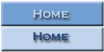 The first thing you need to do is create what's referred as a "stacked" image using a graphics tool such as PhotoShop, Fireworks, etc. A stacked image is an image that contains all states (inactive and hover) in one single image stacked one on top of the other. (See image to the left for an example.)
You will need to create one of these images per as many menu options as you may have. Once you have created your images, upload them to the appropriate SharePoint image library.
Take note of the actual size of your image (on a related note, all images should be the same exact size to work smoothly). You will need this information in the third step, where you will set the appropriate values on the CSS code. In our example, the image size is 210 x 106 pixels.
Step 2: Create the Markup on the Master Page
The HTML code needed is just a link with an id and a span element wrapped around the link text. You will need to insert it on your customized master page and where you want the left navigator to display.
<a id="homeMenu" href="<insert link here>" title="Home"><span>Home</span>
The ID given to the link in the example is "homeMenu." This allows you to style the link via your CSS. Then, the actual link text is placed inside a span element, which means that you can hide the link text with your CSS and display the image instead, yet the link still looks like a regular text link to browsers not using the style sheet (such as, for example, a search engine spider or text-only browser).
You will need to insert this markup text for each of your menu options and changing the ID, HREF, and Title values for each option as appropriate.
Step 3: The CSS
Finally, to turn the regular text link into a rollover button, you need to modify your CSS style sheet by applying the CSS below.
#homeMenu
{
display: block;
width: 210px;
height: 106px;
background: url('<insert_link_to_image_here>) no-repeat 0 0;
}
#homeMenu:hover
{
background-position: 0 -106px;
}
#homeMenu span
{
display: none;
}
The display: block line allows you to give the link a width and height, as well as set your button image as a background. The next two lines set the width of the link element to the width of your image, but it also sets its height to half the height of the image (that would be the height of one of the button images in the stacked image). This means that just the top, normal button image will appear within the link by default. The bottom, which is the rollover image, is cut off, therefore remaining hidden.
The next line (background-position: 0 -106px;) selects the link's :hover pseudo-class to style the rollover state. What happens is that the background image shifts up, in this case by 106 pixels, which is half the image's height. This hides the normal button image above the top of the link element, revealing the rollover button image within the link. (Another way of thinking about it is as sliding the image upwards within the "window" of the link.) When the visitor moves their mouse away from the link again, the button slides back down 106 pixels, returning to its default position, and revealing the normal button image within the link.
The last line, display: none, hides the link text for browsers that support CSS and images.
(Optional) Step 4: Creating More Than One Button
If you want or need to create more than one rollover buttons, copy and paste the HTML and CSS as many times as needed. Just remember to give each button a unique ID in both the HTML and the CSS, as well as changing the background image for each button in the CSS.
Another alternative would be to style the link text to be in the center of the button image, rather than being hidden. In this case, you would only need one (blank) button image for all the menu options. The only con this approach has is that you lose some control over the look of your button text and the buttons may not look as nice.
Last Thing...
Don't forget to modify the master page to point to the customized CSS.
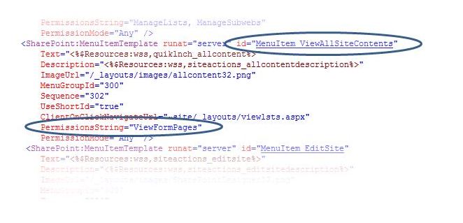
Use this solution if you are requested to completely hide the View All Site Content menu option from the [Site Actions] menu of a site.
1. Using SharePoint Designer edit your custom copy of the v4.master master page
2. Using SharePoint Designer's Code view, locate the section with an
id="MenuItem_ViewAllSiteContents"
3. Once you located this section, locate the PermissionsString and change the default value of "ViewFormPages" to "ManageWeb." 4. Save, check in, and publish your custom master page
5. Open the site in the browser and test it with a few users who have been granted different access level. With this new setting, the View All Site Content option will display only for those users who have access to higher features within the site. Click here for more settings for the Permissions String.
Every time we had to start working on a new SharePoint site that had to be customized for look and feel and for which we' would be using the v4.master master page, we always ended up having to clean our own copy of the corev4.css file. One day we got tired of doing this and we decided to export a clean copy of the css file where the whole team could get it from whenever they needed it.
So here's the file I'm talking about.
Tip: If you would like to hide the Quick Launch (or left navigation pane) for all the pages on a given site, you can insert the code below within the header (<head>) of your custom master page using SharePoint Designer.
The easier way to do this would be to insert a Content Editor Web Part anywhere on the page for which you would like to hide the Quick Launch and insert the code in the HTML Source section of the web part. However, once in a while I face a couple of things with the Content Editor Web Part since we upgraded to SharePoint 2010. And that is that it many times adds blank lines, creating empty, blank spaces on my pages, or it changes my HTML code once I save the web part or page. So I prefer to put the code on a text file (you can use your computer's notepad and that should suffice) that I then upload to some document library on the site. Then I use the Content Editor Web Part to reference the file where I have saved the code. In this way I can prevent both SharePoint from "compiling" and changing my code to whatever, and I avoid the bug that adds blank lines to my pages where the Content Editor Web Part displays. But this is my preference. You can do whatever feels better, easier, or more comfortable for you.
The code you need is, as follows,
<style type="text/css">
#s4-left-panel
{
display:none;
}
.s4-ca
{
margin-left:0px;
}
</style>
|
 RSS Feed